Monday, 31 January 2011

Documenting our Photoshoot.

I thought it would be a good idea to document our photoshoot, so i came up with the idea of making a short fashion film of our shoot. So we could look back at what we had done but also we could have the film at the beginning of your power point i thought it would be a good way to get people engaged and interested in what we have been doing and what the final outcome is going to look like. 

I began to look at Fashion Photographer/Film maker Stephen Klein. His films are really striking and shocking even though our film isn't going to be shocking in anyway, i just though the way the film was put together was very cleaver and liked i the idea of lots of short clips put together. 

I wasn't able to upload this film to the blog because it wasn't on YouTube but here's the website where i got my inspiration from.  

http://www.stevenkleinstudio.com/www/index.html 

Posted By Jayne Arundale.

Final Colour Palette

When we did the photoshoot, we knew what kind of of clothing we wanted but to us it was more about print's and patterns rather then the colour! We liked the idea of mixing and matching to create a more quirky look, moving away from Minnie's "perfect girly" image that she is known for.
It was vital to include polka dotts, as they are the most iconic symbol alongside the ear's that make you instantly recognise Minnie, however we thought why not add some stripes and check prints to mix it up a bit? Having liked this idea, it gave a modern twist and edge that we wanted for our different looks.
When we put our wardrobes together,(photo's of original ideas were posted on facebook page )we narrowed down outfits, we found that a lot of the clothing did contain Navy and red which would of symbolised girly Minnie and one particular outfit we chosen had a nautical twist so I have researched into that trend while also sticking to black shades and different types of textures for the more edgy Minnie. Leather leggings were one of our favourite pieces for this look,they symbolised Minnie's legs and  they worked with all different types of tops, which were chiffon materials and had printed patterns.
By Leah Brown

Nautical look, red with blue stripes we did some styling similar. 

The red Lips..vital to Minnie's look. 

Small Polka dotts. 

The black and white dotts. 
Trends showing how you can wear different types of stripes.

Mix match of prints. 


Sunday, 30 January 2011

Beauty is only a click away.

Dove made a campaign for real beauty to go with there pro-age and self-esteem campaign's.Here is the original advert.
Pro-age campaign

 
YouTube Video showing us how the Dove image was manipulated.
I found this video on youtube but i first saw this video in a my photography lecture, this video was shown to us to make us realize how PhotoShop is being used to create the perfect image.
PhotoShop is a useful tool when working with high quality cameras because the camera is going to pick up the odd imperfect features. But i think in the case of the Dove advert i dont think it was right to call the add or campaign "Real Beauty".


Posted By Jayne Arundale. 
 

PhotoShop Artist's

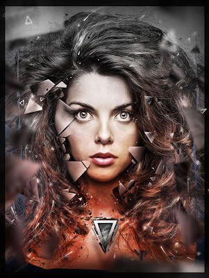
After we did our shoot i thought it would be a good idea to look at PhotoShop Artist's as we would be using PhotoShop to edit our images. I found these artist's called Maciej Hajnrich, Marco Escobedo and Cynthia Sheppardt, who do some amazing work using PhotoShop. Even though we wont be making these extreme adjustments to our images i thought these images would be quite interesting to look at.           

                                                              Maciej Hajnrich

                                                        Marco Escobedo

                                               Cynthia Sheppardt

I thought this last artist really linked to our work because the images are quite like cartoons in the way they don't look realistic. This is maybe something we could think about because when we are editing our images we could try different effects over the photos and see how they work out and see what effects we can create.  

Posted by Jayne Arundale.

Saturday, 29 January 2011

backstage photos

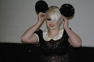
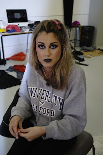
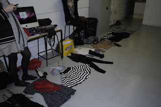
Here are some pictures i took that show the backstage before the photoshoot.


The result!!!


We had a various number of outfits for the models.


At the end we decided to go woth a white background with a shaded lights.
 

by Michelle Vacchini 


Thursday, 27 January 2011

Homemade Ears

We thought it would make our shoot more interesting to have different kinds of ears made of different materials and sizes.

I created these ears using a doughnut shaped ring and wrapping black wool around them and attatching them to a plain black headband. I think they are going to look really effective in the shoot as they are much bigger than the other ears we have got. The wool is going to add a nice texture to the final images- especially if we do them in black and white.

by Kate Murray.

Mickey and Minnies Evolvement through the Years

If you look at the original cartoons of Minnie and Mickey mouse in their early black and white versions to the modern day cartoons you can really see the changes that have occured:


The earlier cartoons are much more like animated silent movies- they are very musical (with pianos being a key feature) and there is little or no speech. Minnies flapper style of dress Kirsty described earlier is also clear in these cartoons as Minnie is wearing a little hat rather than her iconic bow. The style of the cartoon is much more simple also as it is in basic black and white and the way in which they move is totally different to how the modern day mickey is animated.


I picked these three videos to show the progression of Mickey and Minnie through colour and to the most recent style of cartoon which is no longer illustrated but animated. I think it is important that we try and convey this growth and evolution somehow in our images- whether that be through our outfits or our use of colour.

I think it is also important to notice that throughout the years and many changes to both Mickey and Minnie- the one thing that has remained constant are the iconic ears!

by Kate Murray.

Film Styling Inspiration: True Romance

I saw a film on Sunday night called True Romance (by Quentin Tarantino) and the styling really stood out to me and I just thought I would post it on the blog. The film is an American Romance and the title is based on those of romance comic books- and I think this is reflected in the styling as it is very colourful and fun with lots of animal prints and patterns featuring on most of the clothes. The film itself is quite violent and has some dark elements to it but in the middle of it all it is a romance.

I have found this video on youtube of a series of images of the film. If you can ignore some of the more violent images, there are some really good images of Alabama (aka Patricia Arquette) that I think would work really well in our shoot. In particular look out for the red polka dot dress and the pink 'lunchbox' style bag:


by Kate Murray.

Inspiration from Magazines

Movement:

Our photoshoot is being shot in a studio environment- and our only real props are going to be the iconic ears. This means we are going to have to get our models to really fill the space in the picture and the examples I have found below show different ways in which models have acheived this. I will be bringing these images along to the photoshoot tomorrow in order to inspire our models and our photographer.


                                                                                        Dazed and Confused
                                                                                                 Jan 2010

                                                                   Harpers Bazaar 
                                                                                               Jan 2010 


Vogue
Jan 2010

Colour:

We are planning to use black and white imagery for our final four images- but I think it is also important to consider using colour within the images aswell. Mickey and Minnie mouse may have started off in black and white but now they are created in vibrant colours and I think this needs to be reflected in our shoot.


I love these images taken from Dazed and Confused magazine. I think this idea of having the model in black and white with a strong, virantly coloured background would work perfectly in our shoot. I really like the way in which they use a strip of colour down the edge of the image. It is a way of combining the original black and white style of mickey/minnie mouse with the more modern day look they have and representing it through our images.


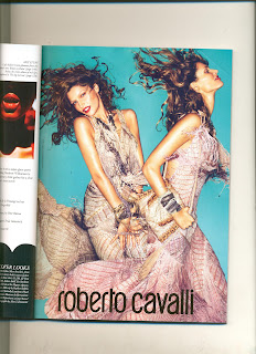
I liked the use of the background colour in these images and it also links in with the Geisha style that we have been researching into. The way that the two models are positioned together is also really interesting and is definately something we need to consider as we will be using two models in our photoshoot.


I felt these Prada images combined the use of bright colour with shapes really well. Even if we were to have our images completely in black and white I think we will need to focus on patterns and shapes in our images as the polka dot and striped look is often used with Minnie and Mickey mouse.

by Kate Murray.

Wednesday, 26 January 2011

Photographer Mario Testino.

Fashion Photographer Mario Testino is frequently doing photo stories for Vouge, Gucci also photographing the celebrity's. Hes best known for photographing Dianna, Princess of wales.
The reason i chose to post this photographer is because the work he dose is mainly in black and white and this was something we wanted to try in our photoshoot.

If any of these photographs where in black+white i don't think they would have half the impact on the reader. The contrast within the shades just brings so much depth to the photograph. I think if we create a high quality RAW photograph and play around with the photograph on Photoshop and have the correct lighting i think our photographs would look great in black and white. But as a back up i think we should shoot in colour and then we can see what they look like in black and white just in case because you cant get colour back in a photograph. Its easier to shoot in colour and turn it black and white.

I also think the lighting works well in these photographs the only thing is i think with our shoot we will be working in a studio and will want backdrops of different colours or just a plain pristine white backgrounds. So if we did want to change the back ground it would be easier to edit on Photoshop. So we would be having lighting on the backdrop. but the way the lighting falls on the face or body's in these photographs i think is really nice but im going to try and look for another photographer that suits our photoshoot with the lighting aspect.


Posted by Jayne Arundale.