Our photoshoot is being shot in a studio environment- and our only real props are going to be the iconic ears. This means we are going to have to get our models to really fill the space in the picture and the examples I have found below show different ways in which models have acheived this. I will be bringing these images along to the photoshoot tomorrow in order to inspire our models and our photographer.
Dazed and Confused
Jan 2010
Harpers Bazaar
Jan 2010
Vogue
Jan 2010
Colour:
We are planning to use black and white imagery for our final four images- but I think it is also important to consider using colour within the images aswell. Mickey and Minnie mouse may have started off in black and white but now they are created in vibrant colours and I think this needs to be reflected in our shoot.
I love these images taken from Dazed and Confused magazine. I think this idea of having the model in black and white with a strong, virantly coloured background would work perfectly in our shoot. I really like the way in which they use a strip of colour down the edge of the image. It is a way of combining the original black and white style of mickey/minnie mouse with the more modern day look they have and representing it through our images.
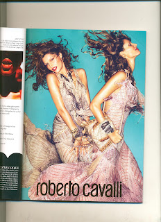
I liked the use of the background colour in these images and it also links in with the Geisha style that we have been researching into. The way that the two models are positioned together is also really interesting and is definately something we need to consider as we will be using two models in our photoshoot.
I felt these Prada images combined the use of bright colour with shapes really well. Even if we were to have our images completely in black and white I think we will need to focus on patterns and shapes in our images as the polka dot and striped look is often used with Minnie and Mickey mouse.
by Kate Murray.


No comments:
Post a Comment